Your homepage is undoubtedly one of the most important web pages on your website. We’ve handpicked 15 website homepage design examples to provide you with some best-practice design inspiration.
Making design choices for your website can be a daunting task. Your homepage is undoubtedly one of the most important web pages on your website. It is your virtual front door. You only get one chance to make a good first impression.
What makes an awesome website homepage?
We know intuitively that your homepage should do one or more of the following seven things very effectively.
- It should help establish your identity. It should answer the “who I am,” and “what I do,” question with enough clarity so your site visitors know they have arrived at your website – when they arrive at your website.
- It should communicate a compelling value proposition. It should communicate the “what I do” aspect of your brand or business. If you’re in a very competitive industry (and who isn’t) then it should also answer the “why you” question.
- It should resonate with the target audience. It should help your audience answer the “Am I in the right place?” question. Think how many time you’ve visited a website and you’re unsure if you’ve arrived at the right one.
- It should give your website visitors a clear path to enter your website. It should answer the “What can you (the visitor) do here” question. Use navigation or calls-to-action (CTAs).
- It should be optimised for multiple devices. With over 50% of web browsing now happening on tablets and mobile devices, it is now a no-brainer for your website not to look good on these devices as well.
- It establishes credibility. This is perhaps less important if you’re already a global brand or a recognised authority with your target audience. If not, then your website homepage needs to provide an indication of trust – whether it’s testimonials from satisfied customers, customer success stories, client and/or partner logo, credible awards, or easily recognised credentials.
- It provides a reason to return. Not every visitor to your website will (and should) return to visit again. However, for your target audience, offering samples and links to materials and resources – customer case studies, white papers, guides, etc. – that will pique their interest will serve this purpose.
We’ve handpicked the following 15 websites to provide you with some design inspiration. To keep things simple, we’ll limit our commentary to the parts of the homepage visible on screen (i.e. above the fold) when you arrive at the website. We encourage you the visit the homepages yourself to see what lies beneath the fold but do bear in mind that that most of these websites are constantly updated.
1. Airbnb
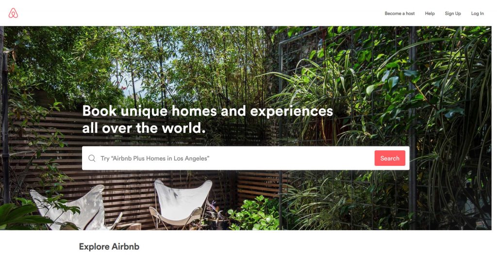
Airbnb is an online marketplace where people can lease or rent short-term accommodation – although they now also provide experiences. Most visitors to their website are probably looking for accommodation (or experiences) so a large search button takes pride of place with a background that cycles through images of actual places and/or experiences for credibility and inspiration. Clear call to action “search” and then there are links in the navigation bar for if you want to be a host, if you want to access your account or if you need additional information.
2. Basecamp
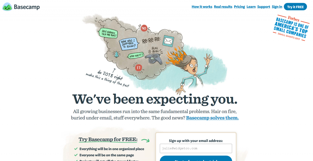
The Basecamp homepage always features awesome headlines and clever cartoons. It’s how they have established their brand and identity. It has a welcoming headline and a sub-heading that invite you to discover what the solutions are to your “Hair on fire” issues. The homepage also features a credibility-boosting quote from Forbes, and a “Try it free” call-to-action button.
3. Casper Mattress
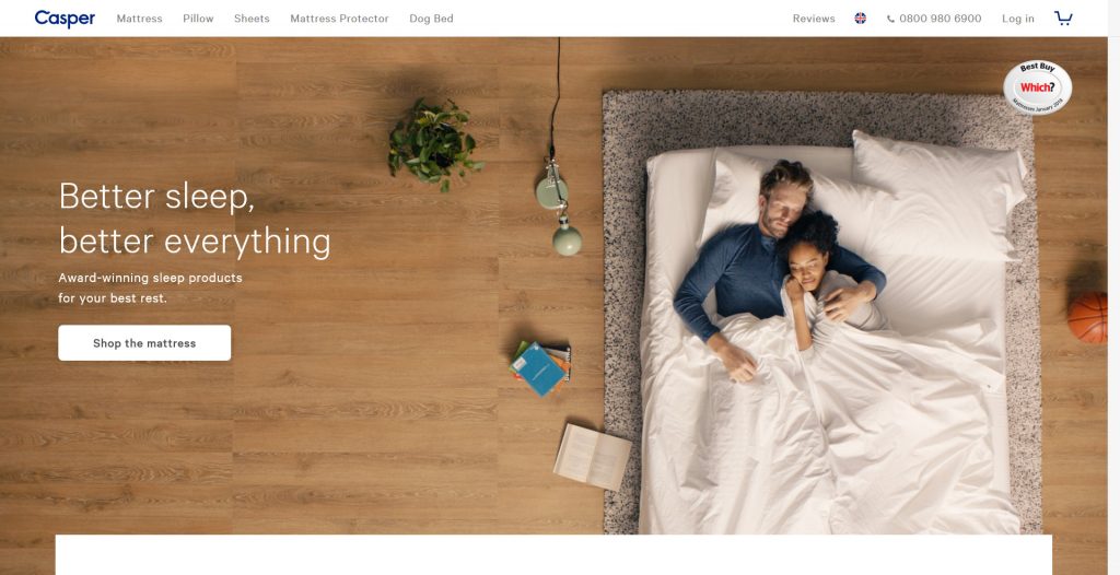
There’s a lot to say about buying your mattress online – you cannot try out several mattresses in person before parting with your money – but somehow Casper manages to do just that. From the choice of imagery to use of words, their homepage (and indeed a large part of their website) focuses on the sleeping experience rather than the technical aspects of the products. There’s the credibility signal in the form of a “Which? Best buy” logo, and the navigation bar includes a link to reviews, and a free phone number – both aimed at converting the undecided.
4. ClearScore
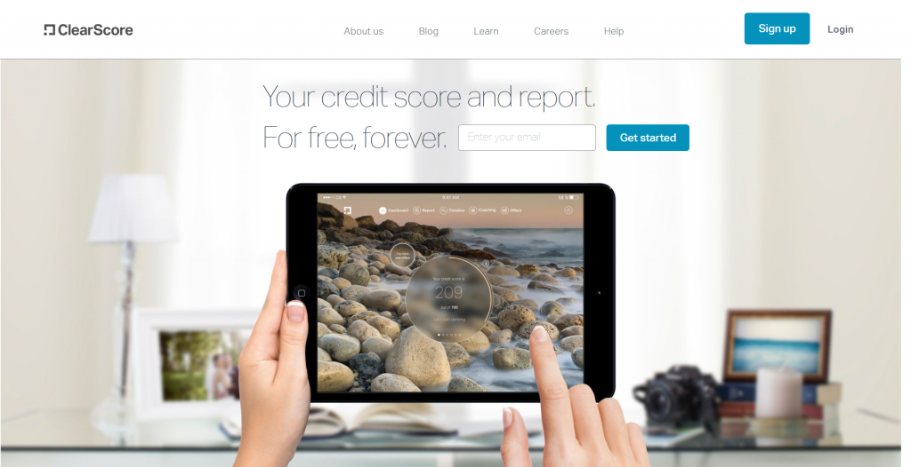
You may or may not have heard about ClearScore, but if what you were looking for is your free credit report – then you’ll have no doubts that you’ve arrived at your destination. This website homepage is also a good example of communicating a compelling value proposition – the only thing better than a freebie – is a freebie that lasts forever. There are clear call-to-action buttons and a simple navigation bar.
5. Ideo
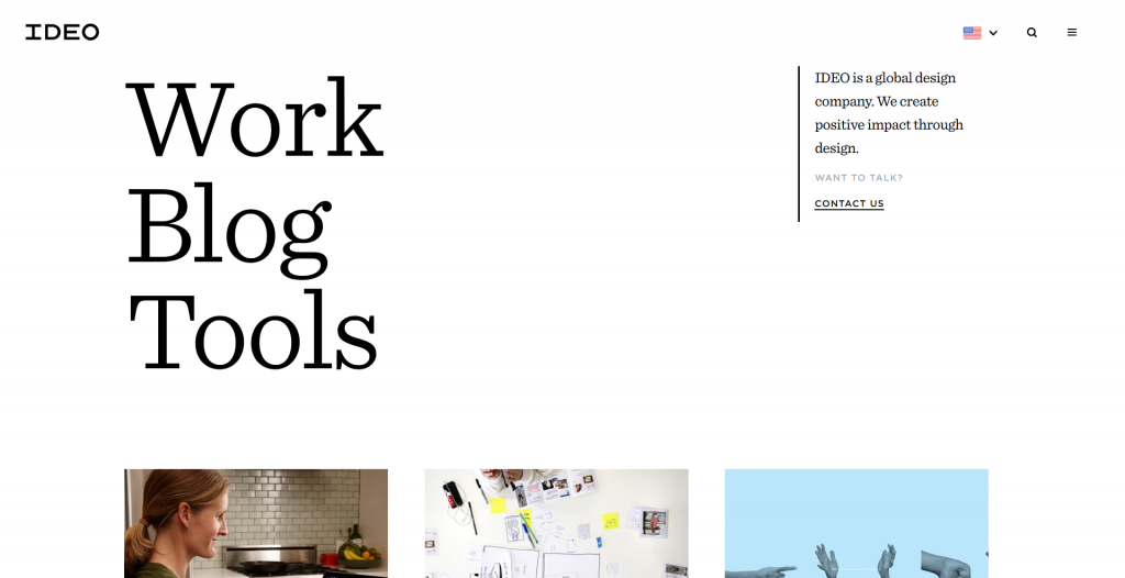
Now here’s a global design company that needs no introduction to designers. But I suspect that designers are not their target audience – it’s probably people who need or buy design services hence they have conspicuously answered the “Who I am,” and “What I do,” question along with a subtle but effective contact us call-to-action. If you’re not convinced then you can view their portfolio, read their blog and browse their service offering.
6. MailChimp
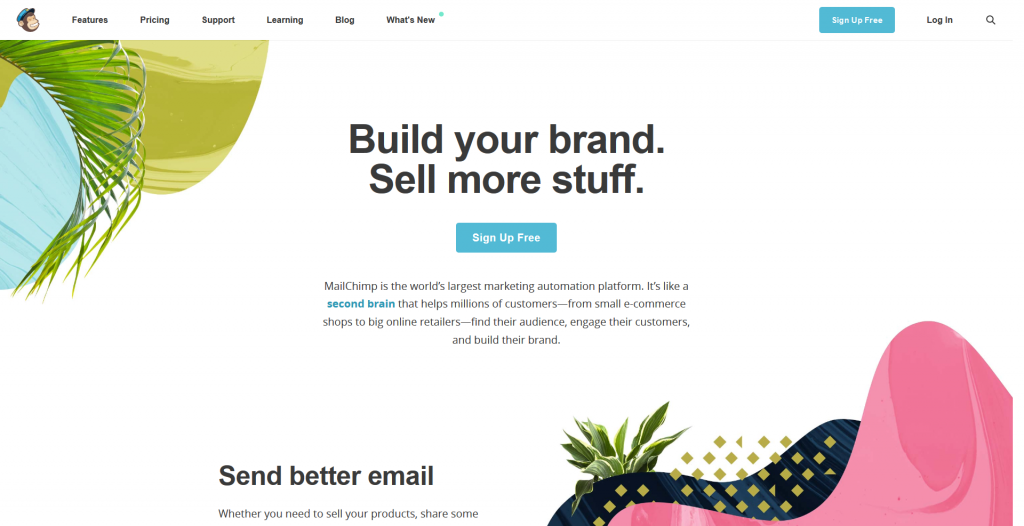
MailChimp has been around for quite some time, so they can easily get away with using the chimp logo. There’s a clear and bold headline about what they do. The call to action makes it clear that signing-up is free. We particularly like the “What’s new” link in the navigation. It’s a useful way to engage returning visitors – it highlights where to find information on what they might have missed since their last interaction with the website, product or service.
7. McKinsey & Company
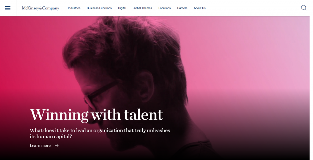
Global consultancy giant Mckinsey & Company invests more than $600 million annually on knowledge development. Therefore, it’s no surprise that a headline with its latest article (or insight) dominates the homepage. It resonates with their target audience – corporate executives at typically large private, public and social sector institutions. There’s a clear navigation bar at the top of the page and a call-to-action.
8. Monzo
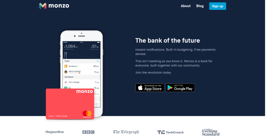
Monzo is a fully licensed UK bank that provides banking services via an app on your smartphone. We love the simple homepage that emphasises how futuristic and revolutionary the service is (let’s be honest, most of us still hold our accounts with brick and mortar banks). The call to action is simple – download the app. And for added reassurance, they have included credibility signal from some of the UK’s leading publishers.
9. Netflix
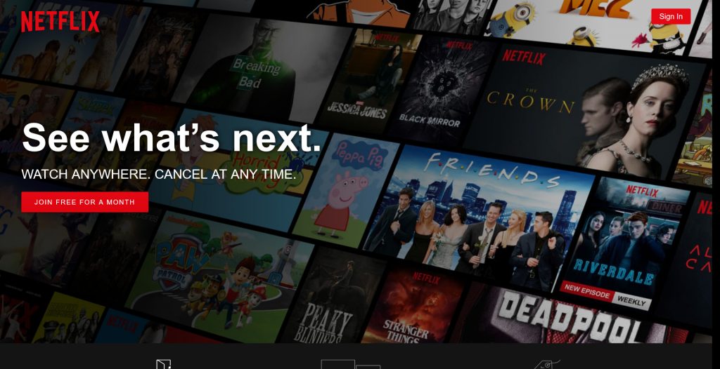
Netflix is a frontrunner in streaming films and TV programmes. The company anticipates that visitors to its website fall into two categories 1) you are either an existing and you’re visiting the website to sign-in to your account, or 2) you are not yet a customer in which case your invited to join free for a month.
10. Option B
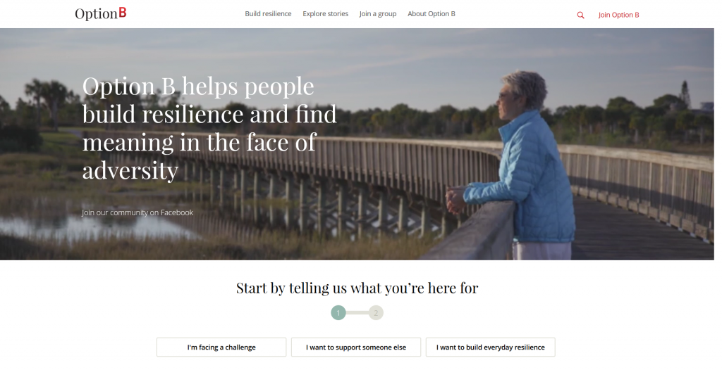
At some point in our lives, we will face challenges. Option B is a new book by Sheryl Sandberg and Adam Grant on facing adversity, building resilience, and finding joy. The website OptionB.Org is dedicated to helping people build resilience in the face of adversity – and that’s what it does with its navigation links that invite you to build resilience, share your story or join a group. We particularly like that the invitation to tell your story is above the fold – by making the image a sensible height.
11. Shopify
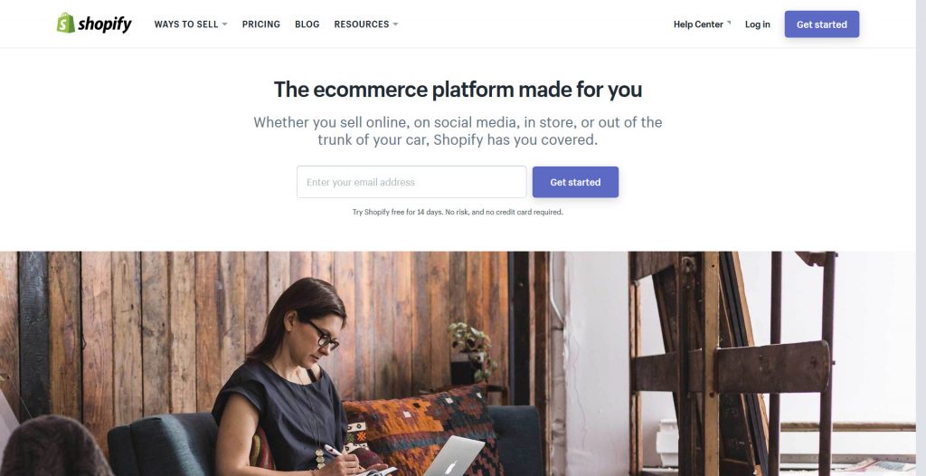
If you’re looking to sell online and you stumble upon this website, what would you do? For us the answer is simple – take out a 14 days free trial and explore. We love a good image – who doesn’t, but the website owners have decided to move this further down the page to make space for the all-important value proposition and call-to-action combo.
12. Squarespace
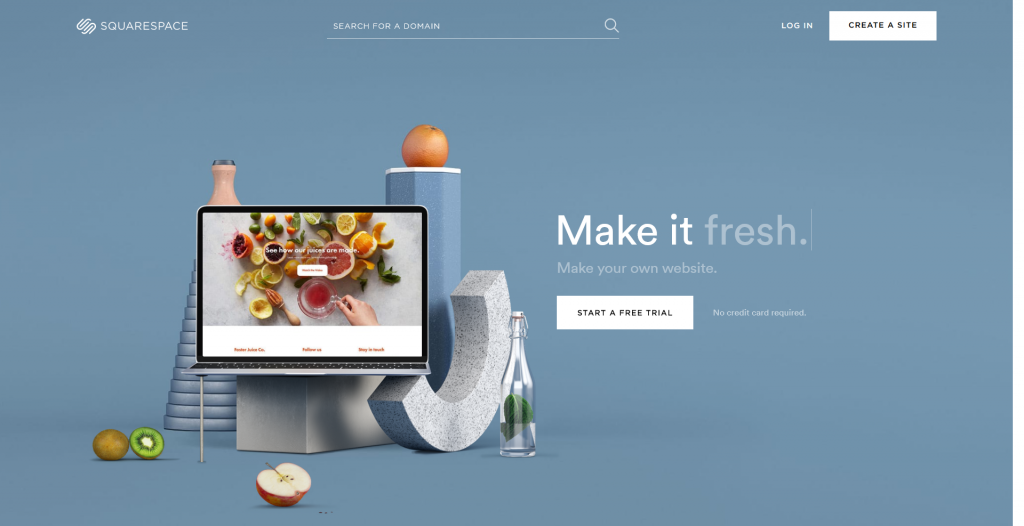
Squarespace is a platform where millions of people create their own DIY websites. Their simple homepage encourages you to “Make your own website” with a free trial.
13. Uber
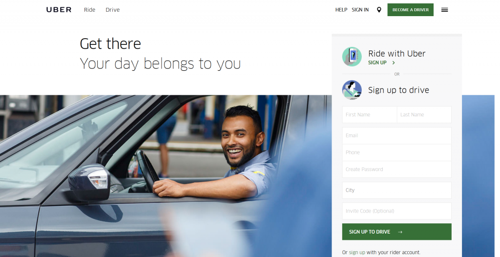
Uber has expanded rapidly since its launch and gained popularity with users. The uber homepage is targeted at drivers with various call-to-action buttons. There are links to information for riders in the navigation, but potential and existing users (riders) access the service via the app.
14. GOV.UK
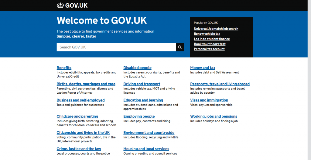
No images, no fancy headlines, no frills. The gov.uk website homepage works like a search engine for finding government services and information. It also features links to help you browse by topic. It’s that simple. And that’s what makes it a great homepage in our opinion. It resonates with us (we’re part of the target audience) and it gives us two clear paths of entering the site – search or browse.
15. Water.org
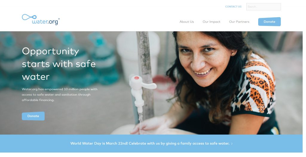
Water.org is a non-profit developmental aid organization. They help to bring safe water and sanitation to the world through access to small, affordable loans. Water.org relies on donations so their call-to-action is for you to donate. The optimistic header image is a great way to capture a positive emotion that results in action.
Does your website need some kerb appeal? Get in touch with our web design team for a confidential conversation.